Introduction
Every day we come across much numerical data in newspapers, magazines, and on television. A data can be an item of text such as a name or an address or a number or numerical expression. Data is a collection of facts, such as numbers, words, measurements, observations or just descriptions of things.
For data to be meaningful and useful, the items of data must be gathered or captured and recorded in a systematic manner. This is referred to as data handling.
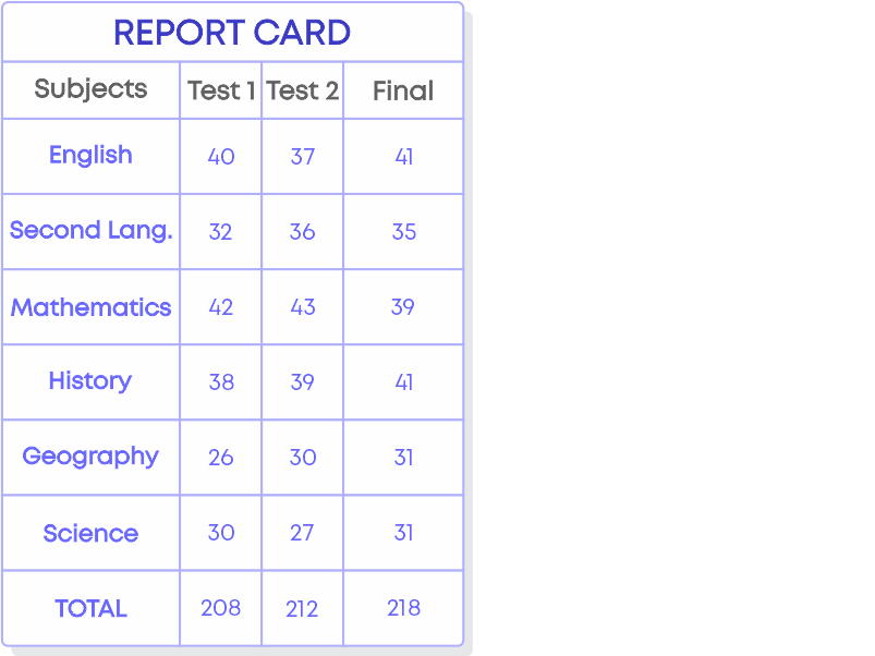
We use data in our daily life. For example, your roll number in school and the number of students in your class is data. Do you have your report cards from class I onwards? Try to observe one – you will notice that the report card has been divided into multiple categories, such as subjects, grades, terms, etc. All the data pertaining to the progress of your education is organised in these cards.
Let us watch the video to understand more about data handling and why data handling is important.
Concepts
The chapter ‘Data Handling’ covers the following concepts:
Collecting And Organizing Data
You know what data is and its applications in real life. Data that has been collected in the original form is called ‘raw data’. Each item in the raw data is called an observation. Raw data is difficult to read, so we organise data so that we can interpret the correct information. Data can be organized in a tabular form.
Remember, data is not the same as information. Information is derived from data. Data should be organised and presented in a meaningful context so that we can analyse and get the required information.
For e.g., ‘Performance of the class’ is the information we get from the data of scores of all students.
Hence, data and information are not the same.
The process of collecting and documenting (writing) information is called recording data. Recording of data depends upon the requirement of the data. Collecting the data is important as it gives the desired information.
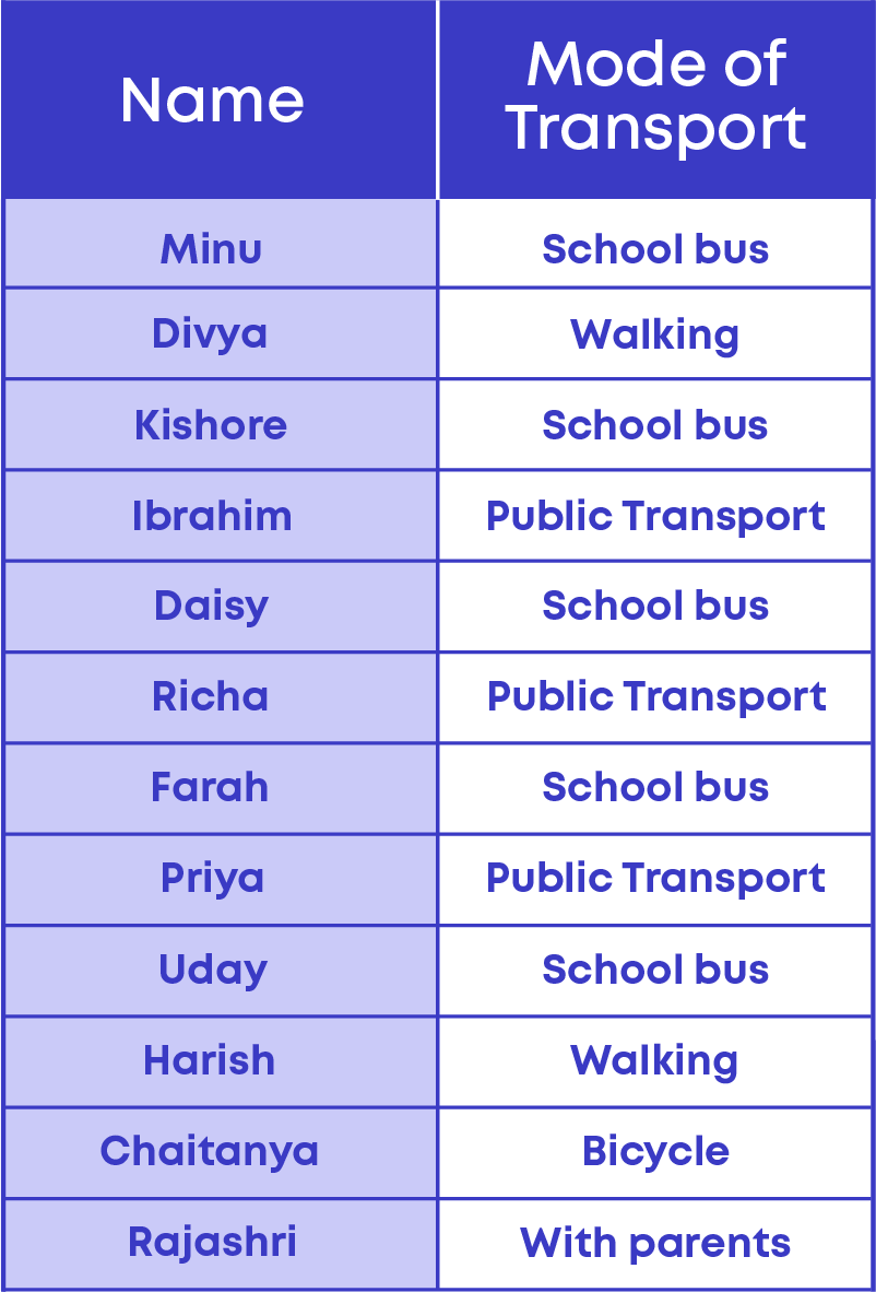
Consider an example: The teacher of class 6 wanted to find the number of students coming by each mode of transport. So, the teacher assigned a student named Anika to collect this data from each student in the class. Anika asks all the students for the mode of transport they use and writes the findings down on a paper as shown.
When we are collecting data, it is important to know what purpose we are using it for. Before you start collecting data, find out exactly what you need it for. This will help minimize time and give accurate information.
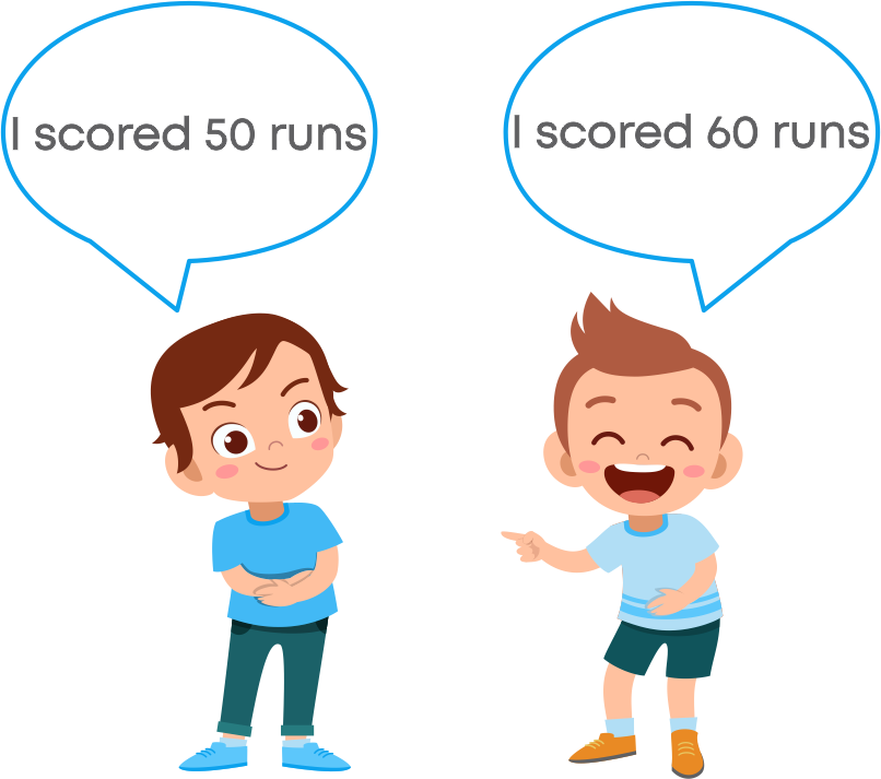
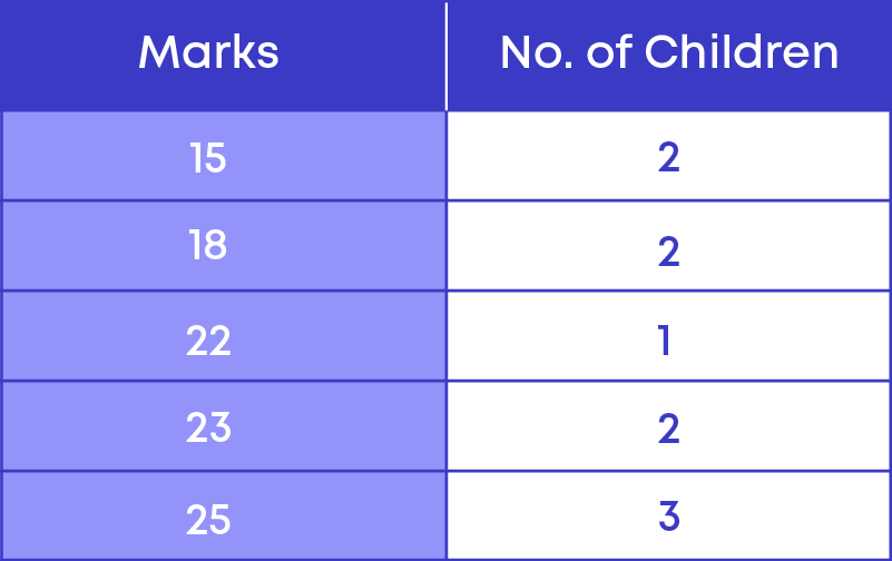
If you just collect some numbers randomly, they are not going to have any meaning. It is only when you arrange them in a particular order or categorise them according to relevance that they would make sense. Let us take an example. Suppose your teacher conducts a test in school; what is the data that you get here?
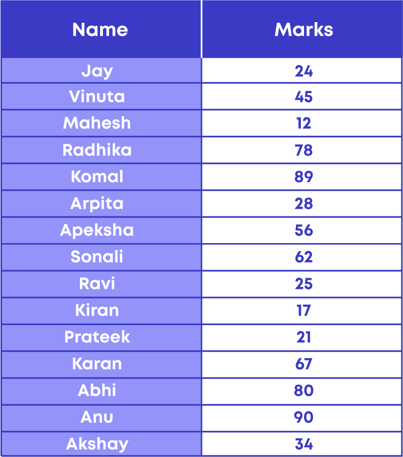
The data here is the number of classmates, their names, and marks. Now, if your teacher wants to know how many students scored below 30 in the test, it will become difficult and time consuming to get the required information from the given raw data.
To find the number of students who cleared the test, i.e., scored above 30 marks, we shall arrange the marks in ascending or descending order. In the table below, the given raw data is arranged in descending order.
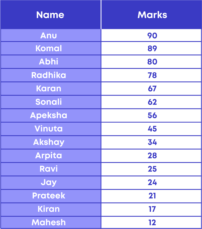
By looking at the table you can easily say that there are 6 students who scored less than 30 marks.
What did you understand? We can get the required information only when the data is organised. So, how do you organise data? Take another example:
The heights of all students in the class are as follows.
138 cm, 133 cm, 135 cm, 130 cm, 140 cm, 135 cm, 128 cm, 124 cm, 135 cm, 142 cm, 140 cm, 139 cm, 139 cm, 130 cm, 128 cm.
The next step is organising data. The raw data can be arranged in two ways:
- Ascending order
- Descending order
Arranging data in ascending or descending order is one of the ways of organising data.
Next, let us collect the same data with the names of students and organise it in a table as shown:
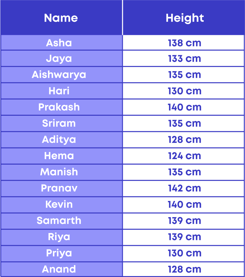
This way of writing data in the form of a table is called tabulated data. Data written in the form of a table is called tabulated data.
Organising the data helps us in many ways, such as:
- It is easy to interpret and analyse the organised data.
- It decreases the time consumed to search for required information.
- It helps in reducing data loss and errors.
Data Representation
Tally mark is a form of numeral used for counting. The general way of writing tally marks is as a group or set of five lines. The first four lines are drawn vertically and each of the fifth line runs diagonally over the previous four vertical lines, i.e., from the top of the first line to the bottom of the fourth line. Tally mark is the fastest way of keeping track of a group of five. Follow these steps to make a tally marks table:
- Arrange the data in ascending order.
- Count the number of observations for each data. Then, draw the table.
Let us see where tally marks are used.
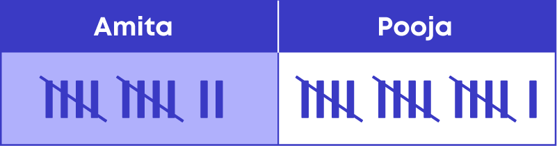
- Tracking scores of an ongoing game
Tally marks keep adding the score rather than erasing the number and writing again. For example, the number of objects identified by Amita and Pooja in a memory game are represented below:
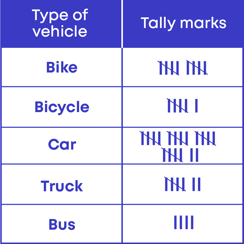
For example, a survey was conducted in the locality on the type of vehicles owned.
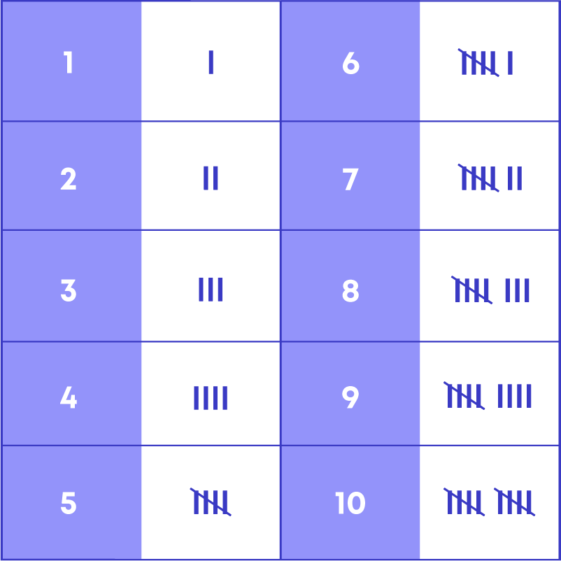
The tally marks for the first 10 numbers are as follows:
Now, consider the following table showing data collected from children on their choice of drinks:
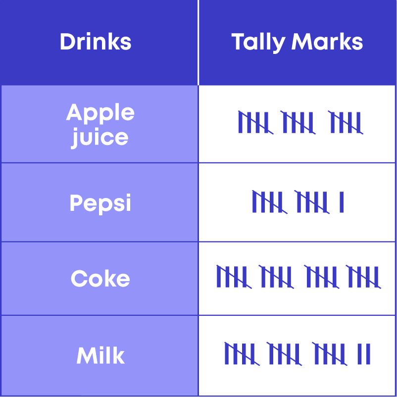
By referring to the given table, you can answer questions like how many children like milk, what the most popular drink is, how many children like either Pepsi or Coke, how many children were surveyed in total, etc. In this way, you can interpret a tally marks table.
Follow these steps to prepare a tally marks table:
- Make a table with two columns: Category and Tally marks.
- Count each data and simultaneously place the tally marks.
- If a large numerical data set is given, arranging the data in ascending or descending order will help us in making the tally marks table.
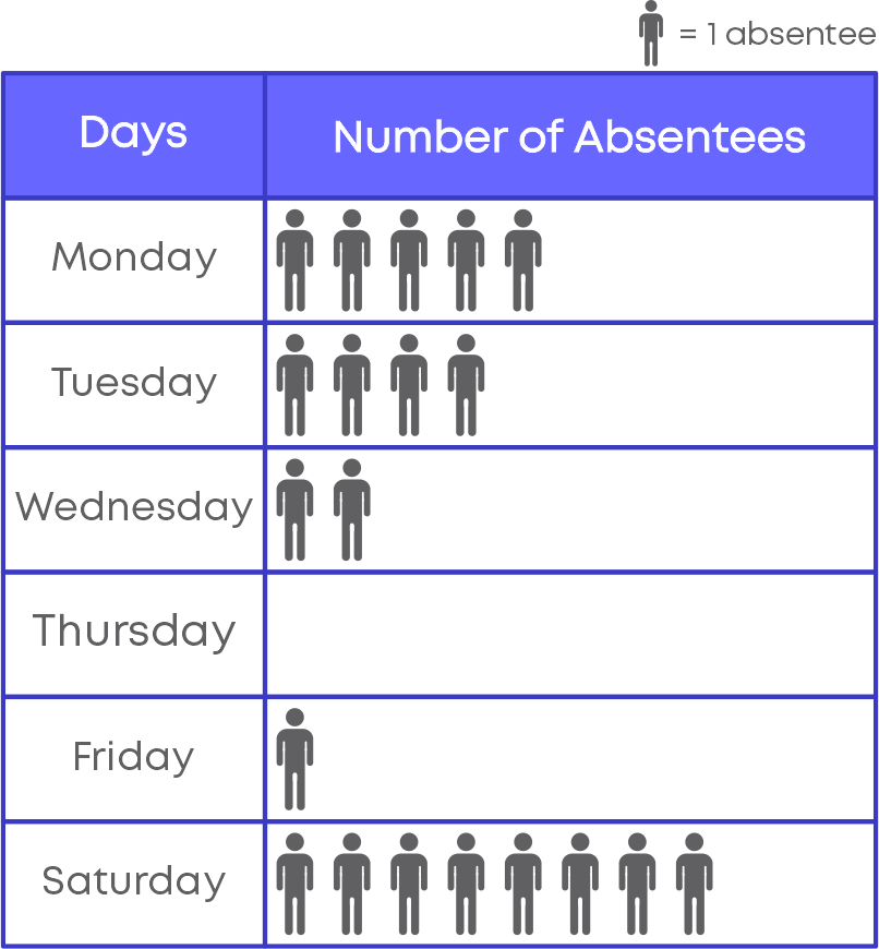
A pictograph is the representation of data through pictures of objects. In other words, a pictograph uses pictures and symbols to convey information about the provided data. To draw a pictograph, choose a picture or symbol, choose an appropriate scale, and draw the pictograph. For example, the following pictograph shows the number of absentees during a week:
A pictograph helps in expressing large amounts of data in simpler form. Further, the symbols help in attracting attention and provide a smart way of representing data. We can say that a pictograph gives all the information in one glimpse and does not require a great deal of explanation.
To interpret a pictograph, follow these steps.
- Identify the scale of the pictograph.
- Count the number of pictures against each category. Multiply it with the scale.
- Use the actual values of the category to interpret the given pictograph.
The following table shows the number of different types of candies sold in a shop:
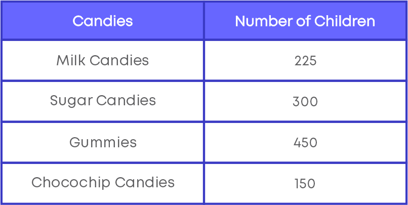
To represent the given data, we need to choose an appropriate scale. Consider the number of milk candies sold, which is 225. Using different scales, let us represent 225 as follows:
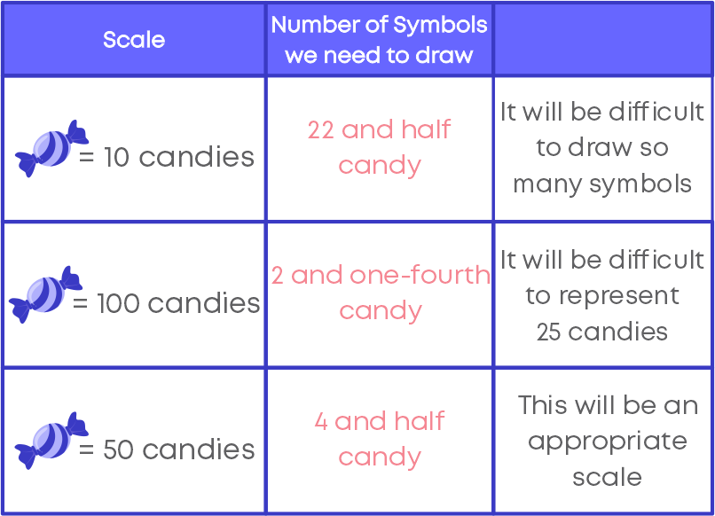
It is important to choose the scale in such a way that we should be able to plot all the given data in a pictograph. When the scale is not mentioned in the pictograph it becomes incomplete and impossible to read or conclude any facts from the pictograph.
To draw a pictograph, follow the given steps:

Bar graphs are the pictorial representation of data. The bars can be either horizontal or vertical and are of uniform width. If the descriptions are on the horizontal axis, the bars will be oriented vertically, and if the values are along the horizontal axis, the bars will be oriented horizontally.
A bar diagram makes it easy to compare sets of data between different groups at a glance. Bar charts can also show big changes in data over time. Bar graphs can be created to show data in multiple, highly visual ways.
There are two types of bar graphs.
- Vertical bar graph
- Horizontal bar graph.
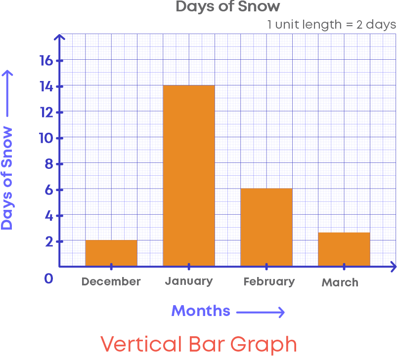
Vertical bar graph
- Bar graphs with vertical bars are called vertical bar graphs.
- The horizontal line will describe the type of categories being compared, and the vertical line will have numerical values that represent the values of the data.
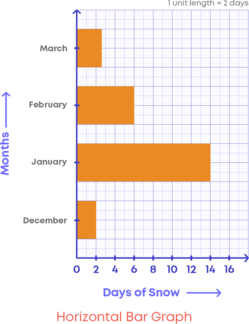
Horizontal bar graph
- Bar graphs with horizontal bars are called horizontal bar graphs.
- The vertical line will describe the type of categories being compared, and the horizontal line will have numerical values that represent the values of the data.
A bar graph is an extremely effective visual to analyse or interpret any information. They are popular because they allow the reader to recognise patterns or trends far more easily than looking at a table of numerical data. Further, bar graphs are an effective way to compare items between different groups
Consider the bar graph given here:
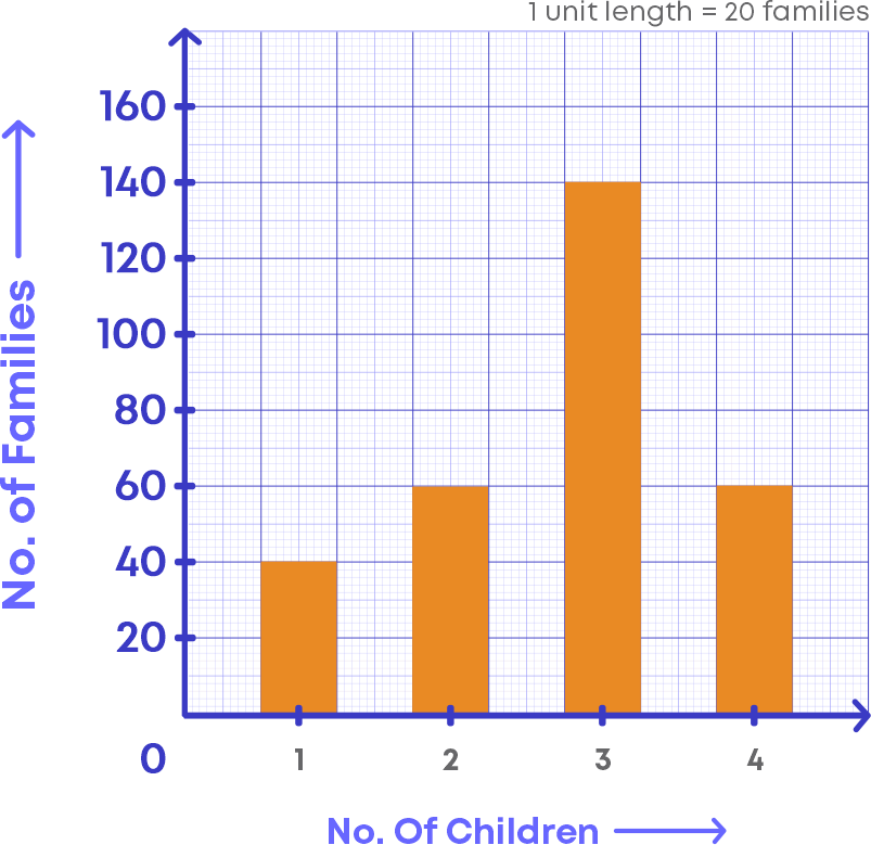
Let us examine the bar graph and understand its elements.
- The horizontal line in which the “Number of children” is labelled.
- The vertical line in which the “Number of families” is labelled.
- Scale, which shows how each unit of the vertical line is defined or the scale is the number used to represent one unit length of a bar.
- In the given bar graph, the scale is 1 unit length = 20 families
Let us understand more about the scale of the bar graph. In the bar graph above, look at the vertical line, you can see that the numbers are written as multiples of 20. This is because the scale of the bar graph says that each unit in the vertical is defined to be 20 families.
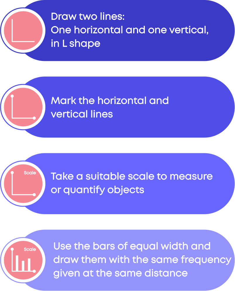
To draw a bar graph:
To read a bar graph:
Common Errors
The following are the topics in which students make common mistakes when dealing with whole numbers:
- 1. Look at the key or scale of the graph to get the actual data.
- 2. How to represent numbers using tally marks?
Look At The Key Or Scale Of The Graph To Get The Actual Data.
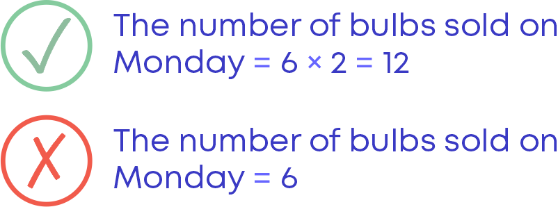
While reading the pictograph we need to look at the key or scale of the graph. The key or scale of the graph helps us to get the actual data. For e.g., the following pictograph shows the numbers of electric bulbs sold in a week:
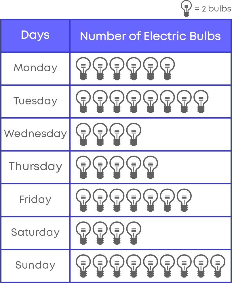
The scale or key of the following graph is 1 symbol = 2 bulbs.
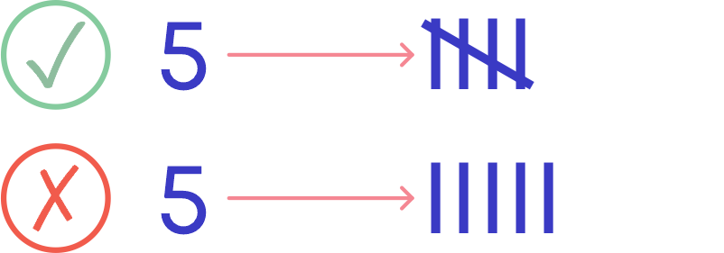
How To Represent Numbers Using Tally Marks?
Follow these to represent the numbers in tally marks.
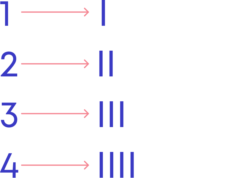
While writing, we do not write 5 vertical lines, instead we write 4 vertical lines and one diagonal line through it.
Conclusion
Now you know all about data handling. Can you solve this riddle?
This is a method similar to tally marks, and it counts to 10 in this diagram:
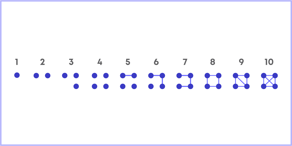
How will you write 27 using this system of tally marks?

Arpana
Author
Arpana is an education specialist with years of teaching Math and developing content. She previously worked as a freelance content developer, developing lesson plans for a reputed publisher of text books and content for various educational companies. She is an enthusiastic teacher who has taught students from India, the UK, and New Zealand.